Redesigning the Athletic App for University
Conducting UX research and UX design on the redesigning of Wisconsin Badger's mobile application.
User Research
UX Design
School Project
Conducting UX research and UX design on the redesigning of Wisconsin Badger's mobile application.

PROJECT OVERVIEW
Wisconsin Badgers is an athletic app for UW-Madison that enable students, faculties, and guests to purchase sports ticket online. Besides, users can also see the future schedule of matches and watch live on their mobile.
GOAL
TArget USER
PAIN POINT
My role
UX Designer, User Researcher
Individual Project
duration
methdology & tools
BACKGROUND
It was an evening after my friends and I watched our first football game on the television.

At first,
we thought we could finish the booking within the advertisement time.
I want to create
a quicker way for the user to quickly book their ticket through the mobile app.
process
Following the design thinking process, I walked through the design process to redesign the application. This is not a linear process. Instead, every step is repeated and looped to continue modifying the design.

USER RSEARCH
To create positive user experiences, involving actual users in the design process is essential. Therefore, I used the following two methods to collect both the story and the behavior of the users to understand others experience when booking a ticket.
First, I conducted...
to get early information about users' thoughts, beliefs, mental models, and experiences.
And here's the insights....
6 out of 6 people use online methods, such as a mobile app or laptop, to purchase tickets. Online buying a ticket makes it more convenient to choose a seat and arrange the schedule.
Among the online strategies, 5 out of 6 people use mobile phones to book tickets through applications or websites. It is more convenient, and you can buy the ticket anytime, anywhere. The only person who does not use mobile is because the current website and mobile application is too hard to book a ticket.
All participants mentioned the bad navigation and the issue of looping pages on the mobile. It is hard for them to find the information easily on the application.
Then, I conducted a
with four users to understand more about the context in which the user is booking tickets.
I asked the participants to think out loud as they showed us the process they undertook when booking a ticket so that I could highlight the emotions users feel, especially when encountering common pain points.
And here's the insights...
Redundant buttons and terrible navigation confuse the users when finding where to book the ticket.
The label name and menu bar are not clear and inconsistency. For example, when the user clicked into "Book Ticket", it leads you to the schedule page, and this confused the users.
It provides too many details on the site, which let the users not to pay attention on the booking tickets action and can't find the information they need.
DEFINE PROBLEM STATEMENT
Due to the massive data collected, I brainstormed to form an affinity diagram to transcript the data and cluster them into several groups to distill the key points.
And here's what I found...
Users need a way to
book a ticket easily
because they want to finish the booking conveniently.
Users need a way to
quickly notice the schedule
because they want to know the latest events.
Users need a way to
have clear navigation
so they can find information and don't get lost in the purchase loop.
...and I have my HMW statement to help me focus throughout the whole project.
ideation
After finding the problem, it is time to design the right solution.
I created the solution following the four stages.

At this stage, I want to generate as much ideas as I can and not to limit myself.

Select possible solutions and create design decisions by story board, task flow.

At this stage, I focus on visual elements and test the solutions to tweak designs.

Last, merge the eligible design together and deliver the final design.
Stage 01
After generating about 25 solutions, I clustered them into groups and mashups and selected the three main solutions to move on to.
Put details in “read more” and leave only the important information.
Adding breadcrumbs navigation to show where/which step the users are now.
Put the search or filter feature on the first landing page


Stage 02-1
To see how the design solution would influence users' daily scenario, I sketched through the storyboard of people purchasing the ticket to show how the design should meet the user's need.
In the storyboard, the user can quickly book the ticket during the advertising time of the game, which perfectly match the HMW statement: to provide a easy and quick way to book ticket.
Stage 02-2
Based on the insights gained from the initial content audits, I defined five task flows for the key tasks and drew out the task flows.
My design thoughts...
Mostly complete every task within one page.
Place the most common use function below as the navigation bar.
All pages are connected with direct links to one other, so users do not need to jump out of the page to other functions.
Stage 03
To prioritize the tasks and narrow down the scope of the project, I went back to the user needs, and I pick the three major tasks: Search for tickets, Book tickets, and Manage Tickets.
I then developed a series of prototypes of the application, from low-fidelity wireframe to high-fidelity to see how the design idea could fix the issues.
I approach my final design by following these design goals.

so the user can easily find information and navigate where they are.

so that users will feel connected to the Badgers.

so users can get access to information quickly.

to make users feel that the application is updating to the latest trends.
#2
To test the scenario of searching and booking, I developed a low-fidelity paper prototype, which is portable and easy to do usability testing by its general structure before we move on to the digital wireframe.

I then conducted the
on the paper prototype to determine whether the new design would solve the users problems.
I created a scenario of purchasing the ticket and asked the users to think aloud while they executed it.

I observed the three testers-John (Taiwanese, 24), Ameya (Indian, 23), and Sindhu (Indian, 25)-interact with the prototype. The three of them completed the task successfully
Though they completed the task, various information on the page still confused them what to click next to select their section and seat.
They all can't find the "check out" button when deciding the number of tickets.
According to the feedback and breakdowns, I redesigned and modified some UI elements on the page and added more indicators on the screen to enable the whole process clearer.
#3
Next, I digitalize the wireframe to add more interaction and see how it looks on the screen. Digitalizing the wireframe helps me focus on visual hierarchy and information architecture before I make decisions about fonts, colors, and graphics.
Problems solved?
Let's check back with the user needs to see whether the UI fits.
because they want to finish the booking conveniently.
The less step the better.
because they want to know the latest events.
Only put important information + Read More button.
so they don't get lost in the app.
Remind the users where they are.


.png)
.png)


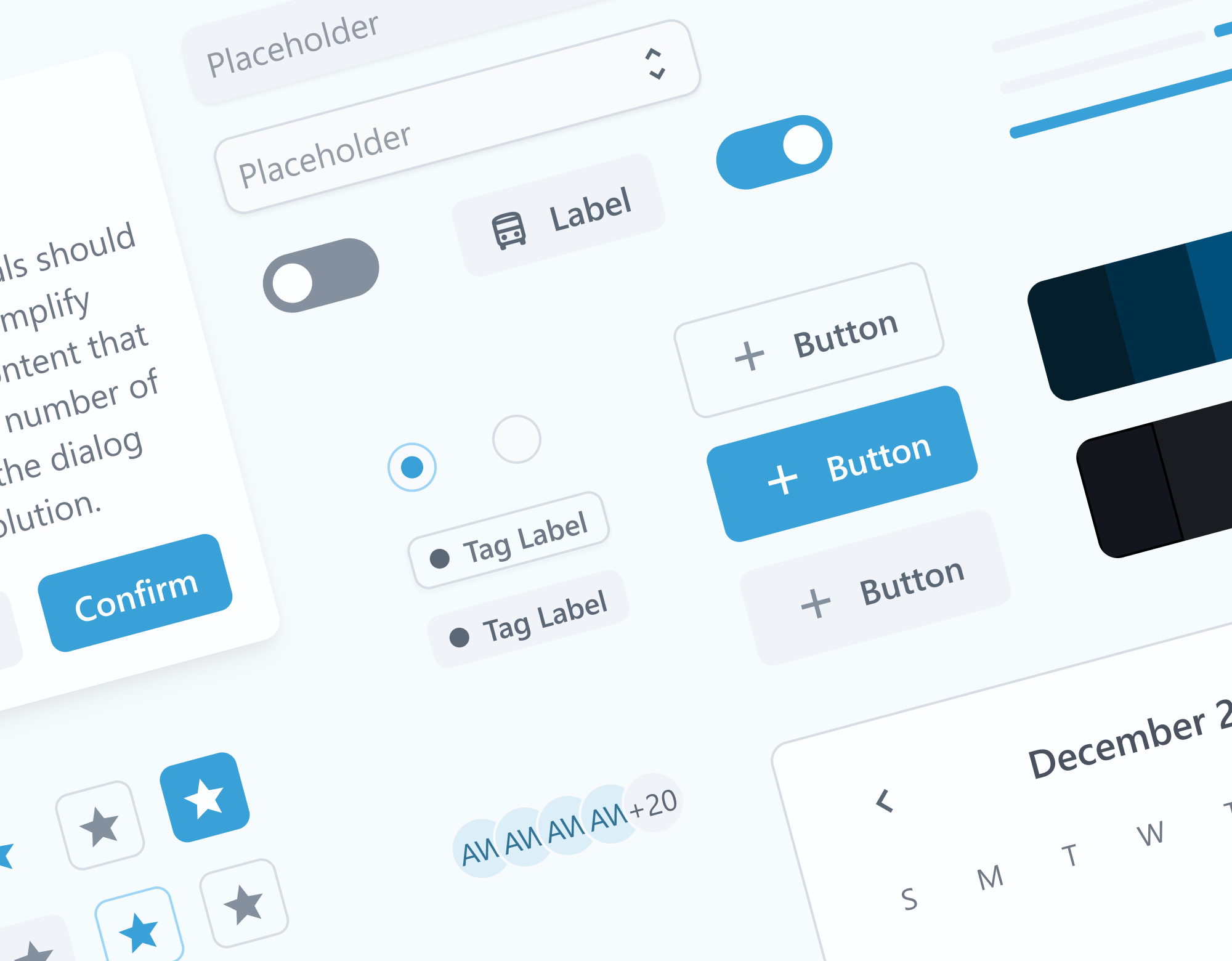
Solution showcase


.png)
.png)

main changes
Here's a quick reminder of the issues we want to solve! Let's see what some main changes are done throughout the whole design process to help reach the users' needs.
Old Design

New Design

Added
Quick links to manage tickets and profile.
Why
Add shortcut to have easy access to the ticket information.
<Problem Solve: Book a ticket easily.>
Old Design

Remove
Quick links to manage tickets and profile.
Why
Hero image spends at too much space.
New Design

Added
Search Bar
Why
To give user a quick way to find the events.
<Problem Solve: Easy access to the event.>
Added
Card view for upcoming events.
Why
Provide users a simple and clean homepage with important information.
<Problem Solve: Notice the sports schedule easily.>
Old Design

New Design

Added
Live Status
Why
To give user a quick view about the event’s status.
<Problem Solve: Simple and clear page.>
Added
Call-to-action Button
Why
To give user a clear access to buy ticket.
<Problem Solve: Easy access to purchase.>
live Prototype
Play around with the prototype to see how the redesign app may help user to book tickets more easily and quickly!
key takeaways
Since this is a course project, I cannot see how it implements in the real world to gather further data and do usability testing. However, there are still significant takeaways that I gained through this project.
Design is a constant process of improving the experience of end users. In every design stage, there is always feedback to be found by end users to optimize.
The design process is always a cycle. The method of brainstorming, clustering, condensing, testing, and brainstorming again is a cycle when optimizing the product.
It is hard to have it perfect at first, so keep brainstorming and tailoring it to define the core value of users.
Defining the problem is often the most difficult for the whole project. However, when you successfully note the problem and brainstorm for the solution, the rest you need to do is follow and execute the plan.