Building Touchscreens for Commercial Cleaning Robot
Designed user interfaces for scheduling and mapping tasks for commercial floor-cleaning robots.
UI/UX Design
Design System
B2B
Robotic Industry
Shipped Product
Designed user interfaces for scheduling and mapping tasks for commercial floor-cleaning robots.

PROJECT OVERVIEW
A new-designed touchscreen interface for a commercial robotic cleaner that will be developed in 2025 Q1 to improve usability for cleaning staff, facility managers, and cleaning companies.
Problem
TArget USER
metric
My role
UX Designer
Team of 10: 4 Designers, 5 Engineers, 1 Director
Focus on user flow and UI design for task management and setting functionalities.
duration
methdology & tools
background
UniRing, founded in 2011 by young robotics engineers, specializes in automating commercial floor cleaning and security robots with advanced navigation.
Their latest model, MIO v1, addresses usability concerns with a more intuitive 10-inch tablet interface. Their initial robot, which prioritized functionality over user experience, resulting in a complex navigation system.

OUr mission
The operation system of the robot switch from remote website to 10 inches tablet on the robot to improve setting convenience.
The old system had several usability issues that needed to be addressed, such as a cluttered interface and confusing navigation.
The transition from mouse clicks to touch controls required a new user flow to be designed for the new system.
key featuRes
Enable the 4 steps setting on the new tablet seamlessly.
My focus ddressed a critical gap in v– Task Management and Setting. This allows users to manage cleaning tasks and define template actions for the robot.
solution highlight

NEW FEATURE
Task and template action is integrated to the step for task management, to ensure the users have a more streamlined setting experience by focusing on one single action in each step.
solution highlight

BEFORE
Confusing task names, limited searchability, and inability to preview task content made scheduling difficult.

AFTER
Implemented filtering, and quick task content previews for enhanced usability.
feature 01

BEFORE
Disorganized settings forced users to search for each option individually.

AFTER
Implemented responsive web design (RWD) and a list view for settings, facilitating future multi-language support. Additionally, settings were grouped and titled for improved clarity.
feature 02

BEFORE
The setting and plan functions both require features to build the map.

AFTER
Settings were organized in a step-by-step manner, and UI design was used to emphasize frequently used functions.
feature 03

NEW FEATURE

COLOR PALETTE
Shifting from laptop to tablet touchscreen, our UI library prioritizes:
Responsive web design (RWD) for optimal viewing
Multilingual support for future expansion
Touch-centric interactions with scrolling and dragging

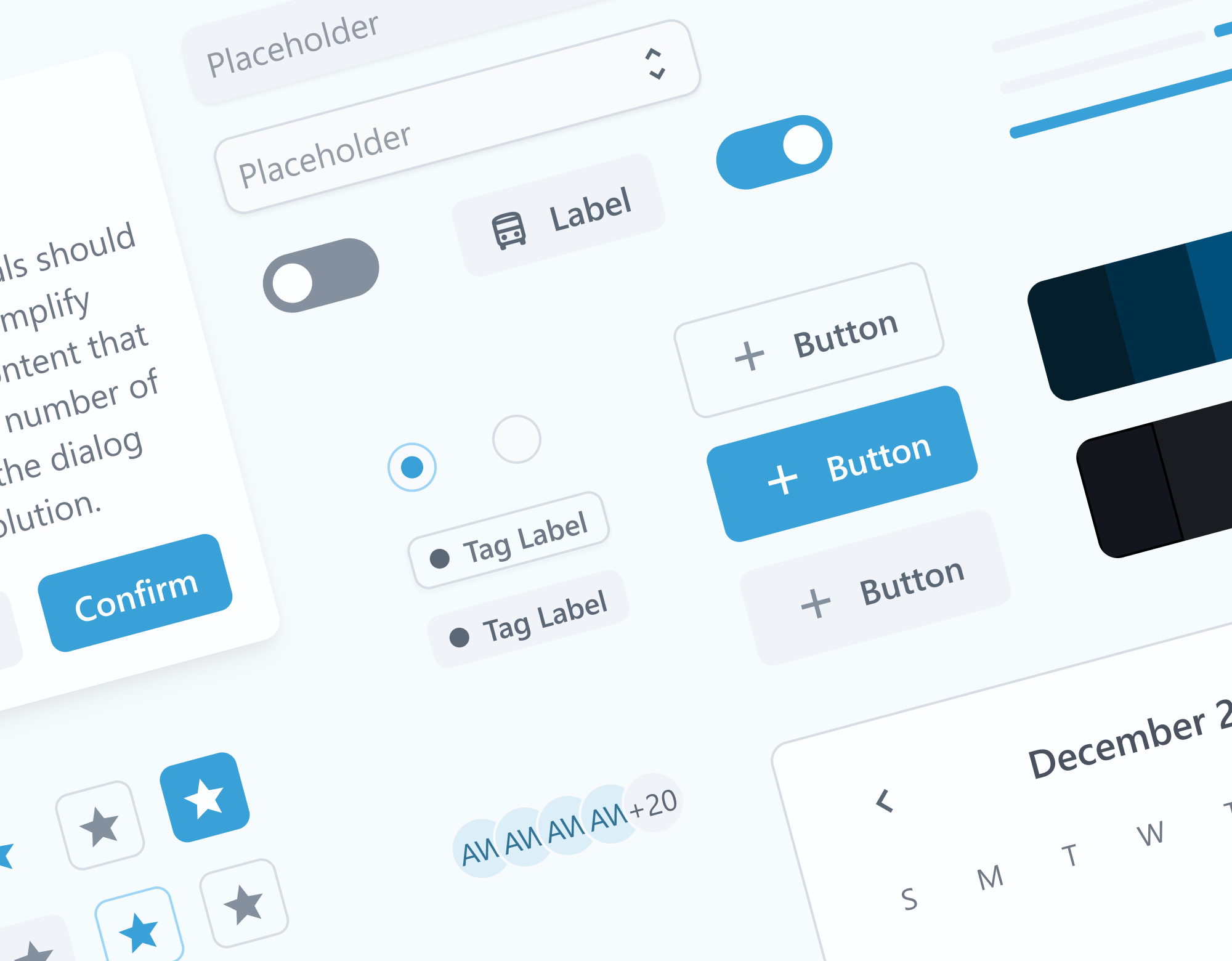
COMPONENTS QUICK LOOK
01 Research
In order to approach our final solution, we began with user research to identify previously overlooked issues. To gain insights into user pain points, we employed the following two methods:
To identify user experience (UX) issues and pain points within MIO v1, we conducted a remote usability test with two participants via Zoom.
We delved into the robotics field to examine the features offered by our competitors.
We utilized a remote access platform to control the robots and a Zoom meeting to observe their interaction with humans.
To gain a deeper understanding of the robot's current user interface, we employed virtual hosting. This allowed us to observe its functionality and conduct usability testing with participants.
Problem
"Umm...Should I set up the action before I start scheduling the tasks? ....Oh I found where it is now.”
-Janitor


Problem
"Umm...Should I set up the action before I start scheduling the tasks? ....Oh I found where it is now.”
-Janitor
Problem
"...is ACTION and TEMPLATE the same thing...and what does TEMPLATE means in practical? Is it same as TASK?”
-Cleaning Staff


User needs
"I don't want the janitor to do the map scanning and editing.”
-Company Superviosr
02 User flow
We initiated our journey by optimizing MIO v2's user flow, focusing on streamlining the process to enhance efficiency and the user experience that fell short in the initial robot's MVP. This resulted in a steep learning curve for users, who struggled with the system's complexity.
process

We began by documenting the existing user flow to understand its functionality. This helped us identify any redundant steps.

Through collaboration with the director, we analyzed key terms from each step to identify their core purpose.

Based on our findings, we streamlined the user flow and implemented consistent naming conventions to enhance clarity.
result
To address the complexity issue, we reorganized the workflow, categorizing and renaming the functions into four intuitive main steps – Map Management, Template Management, Task Management, and Task Scheduler – which significantly reduced the learning curve.

BEFORE
Disjointed Workflow: The original information system scattered essential steps across its architecture, even though these steps themselves followed a logical order. This buried functionality and hindered user experience.

AFTER
Streamlined the Steps: We restructured the workflow, consolidating scattered steps under a unified hierarchy. This not only improved user comprehension but also streamlined the process for increased efficiency.
Recognizing the functional relationship with existing settings, we integrated the four main steps under the "Settings" category.
To ensure the clarity of the hierarchy within Settings, we conducted a quick card sorting exercise with two engineers.
iteration
To optimize the touchscreen experience, I developed and iteratively refined design concepts through stakeholder interviews (internal cleaning staff and customer service) and usability testing, focusing on those with the most user interaction to quickly collect user feedback in the time limitation.
solution
We aimed to provide easy access to the four main steps while ensuring a clear distinction from existing functionalities to avoid user confusion.

NOt applicable
Iteration 1 : Items in Sidebar

APplicable
Iteration 2 : Under Setting
During validation, we discovered that the sidebar was overloaded with options. Additionally, the distinction between 'planning' and 'schedule' functions caused user confusion. To address this, we opted to consolidate these functionalities under a clear 'Settings' category. This simplifies the interface while maintaining efficient scheduling capabilities.
solution
To prevent redundant steps and emphasize the logical order, we implemented a visual hierarchy that clearly sequences the four main steps. This approach reminds users of the logical flow and minimizes confusion.

NOt applicable
Iteration 1 : List View
FINAL SOLUTION
Iteration 2 : Card View
Usability testing showed that card-style buttons for the four main steps improved user experience. The clear visual hierarchy effectively differentiated them from general settings options (also in list view), aligning with user expectations for commonly used buttons.
03 Task management
To tackle the user flow and UI for task management, we divided the four main steps among individual designers. Daily stand-up meetings facilitated design critiques and feedback loops, allowing us to iterate collaboratively.
My area of focus was Task Management and Setting, where users can manage cleaning tasks and define template actions for the robot.
iteration
The primary goal for the task management UI was to streamline task creation and action/template assignment. As a new and previously overlooked feature in MIO v1, it was crucial to prioritize user efficiency and minimize redundant steps. To achieve this, I explored various design solutions.
TArget USER for task management-
solution
The upgraded model empowers users to manage cleaning tasks for multiple buildings with various cleaning types.
task Limitation

NOt applicable
Iteration 1 :
Cautionary Message when users selected different building types.
Validation: This disrupted the user flow and proved ineffective in preventing cross-selection.
Thinking of making the steps easier by automatically setting up the building for users if they don't select one.

FINAL solution
Iteration 2 : Automatic Building Selection
Validation: Upon selecting the first task, the system filters available cleaning tasks to ensure compatibility, eliminating the need for manual selection and potential cross-selection errors.
feature
Technical Limitation

NOt applicable
Iteration 1 :
Inline Action Addition
Validation: While the user requires less screen space to complete the entire task setup, they become confused about what information is missing on the current screen before proceeding.
Usability testing revealed user confusion with adding actions and templates on the main page. I redesigned the process to allow users to focus on a single action or template per screen.

final solution
Iteration 2 : Simplified Task Creation
Validation: Users preferred a streamlined approach where they could simply add tasks and adjust their order in the initial step. This eliminated the need for multiple actions within a single step, enhancing user experience.
03 Setting
The current interface suffers from a scattered layout and illogical order. Additionally, hidden settings requiring non-intuitive gestures create usability problems. A redesign is necessary to address these pain points.
process

Test with 2 engineers (who will be the main users) to group the current settings.

Come up with different design idea to solve the problem.

Validate and iterate the solution design via interview.
iteration
The settings section is unique in that it's primarily used by engineers and admins who won't be performing the cleaning tasks themselves. Consequently, it should prioritize logical organization and clear navigation, making it easy for them to locate the necessary settings and maintenance functions.
TArget USERS for Setting-
feature

NOt applicable
Iteration 1 :
Invisible Settings with Password
Validation: Works for maintenance engineers, but limits future role expansion.
Designed for future role expansion while restricting access to authorized personnel, and improved security with role-based screens accessible through unique login credentials.

final solution
Iteration 2 :
Different screens based on user permissions.
Validation: Multi-level permissions with unique screens (requires login with different credentials for access). Also provide future role expansion features.
feature
before
Disorganized settings forced users to search for each option individually.
Rapid card sorting with the engineers and company admins to figure out the grouping.

final solution
Grouping & list view for future multi-language support.
Validation: Testing with engineers confirmed that information is now easier to find by searching within groups. Additionally, an expandable toggle UI reduces clutter and allows users to hide information they don't need.
Current Status & METRICS
is expected to be developed and will be on the market by then.
robots have been signed for in an agreement with Rakuten Korea thanks to the new interface.
predicted increase in efficiency compared with the initial robot, resulting from the new interface.
key takeaways
Limited access to users due to time constraints and our role as a contractor required us to leverage alternative user research methods. For example, we collaborated with customer service representatives who have extensive user interaction to gather feedback.
Identified crucial technical limitations and time constraints. While these prevented immediate solutions for some issues, we documented them for future backlog prioritization. Focusing on minor tweaks allowed for a faster market launch.
Daily design reviews and stand-up meetings facilitated collaboration between our design team and third-party engineers. Effective time and project management ensured everyone was aligned. This collaborative approach even led to a two-week project completion advantage, affording additional time for usability testing and modifications.